What is a Widget?
A 'Widget' is a content container, which can be sized and positioned as desired on a Page. They are the main method for adding content to your Pages. Some widgets display differently depending on if they are viewed in desktop mode or mobile mode.
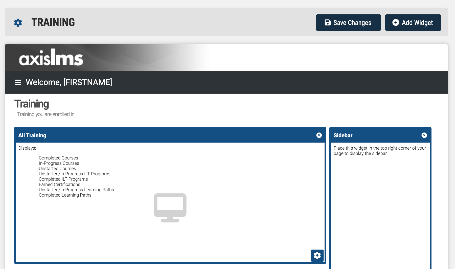
Within the Page Editor's content section, Widgets are represented with a colored border. Along the top, the border is thicker, and includes a header of the Widget's type. This header can be dragged and dropped into other positions on your Page Editor's content section, to construct your own page.
Within the Widget's borders, a summary of the widget will be listed. Towards the bottom right of its borders, a gear icon exists, which opens up this Widget's settings.
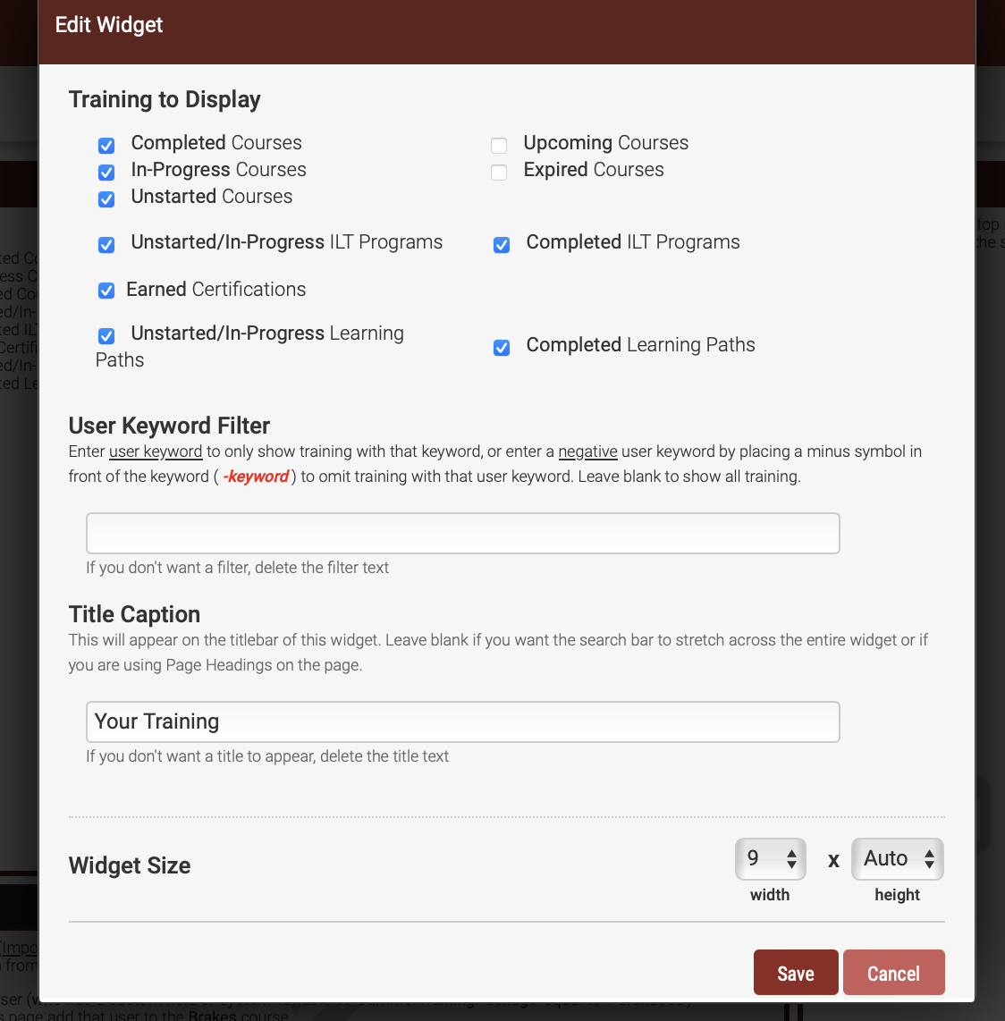
Some settings are common to most widgets, such as height and width; but a majority of the Widgets will include their own unique set of settings.
On the User Interface, all but a select few Widgets are represented by something a User can interact with in some way. Often, the Widget inherits your system's Theme colors, to help keep your system cohesive.
Width and Height
Most widgets enable you to configure the width and height. The measurement system is in ‘grid spaces’.
Each grid space value for height is a fixed pixel size, but the width value is dynamic. The maximum width value for any widget is 12 grid spaces (some widgets may not let you set it that wide). Depending on the width of the visitors/users device and/or browser window, and/or the width you set up for your site, the actual pixel size for each grid width value will be different.
Some widgets let you set up a height value of ‘auto’. When set this way, the content in the widget (which is usually dynamic) will determine the height of the widget when shown to the user. However, in design mode (when we don't know the dynamic content), the widget is displayed using a fixed height. It is important to test complex layouts of widgets when using auto-height.