Axis LMS version 10.5 introduced a new interface for learners accessing from mobile devices. While all the critical functionality is still accessible from your Courses and Portal Widgets; it’s useful to understand how the interface is adapting while viewed on a mobile device. Everything the admin has added -including data based changes like usergroups and event triggers – is still functional and accessible; but certain adaptations, like their sequence, may have changed.
Designed with Mobile in Mind
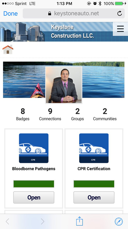
The Axis LMS mobile interface is using a one-column approach. This means that if you’re stacking items adjacent to each other in your desktop Site Designer, those items are going to be re-arranged so that they are stacked on top of each other. Exactly how those items are arranged can change based on different circumstances, but if you’re just beginning to optimize your website for mobile, the easiest way to determine the order your widgets will appear is to go left-to-right, top-to-bottom.
 |
 |
|||
| Desktop View | Mobile View |
Maximizing Your Content in Mobile
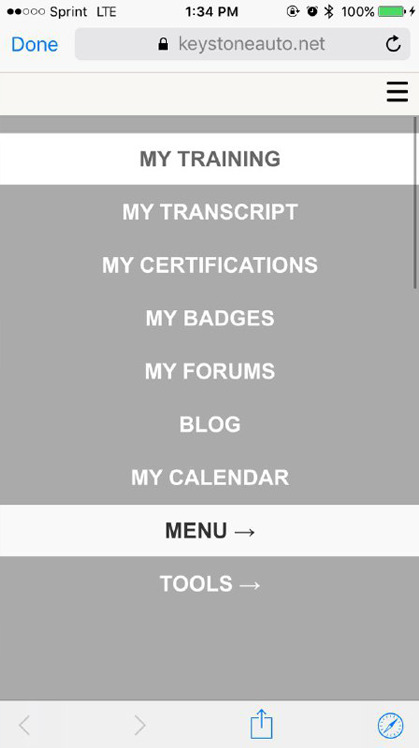
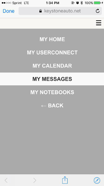
The biggest exception to this rule is the slide-in navigation. Created in Axis LMS version 10.5, the slide-in navigation is designed with mobile in mind. And, like some other widgets, the slide-in navigation does not take up any physical space in your widgets’ area space. Instead, the presence of the widget adds a button onto your banner; leaving the real-estate of your mobile pages to more important content. The slide-in navigation has also become the default on all new courses, to help promote a similar line of thinking that the content of the course should be the most prominent focus on a user’s screen.
 |
 |
|||
| Slide-In Menus | ||||
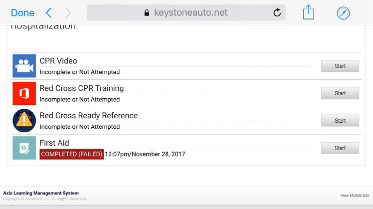
Mobile Course Design
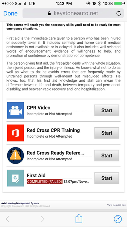
Courses have also been adapted for mobile, once again using the one-column approach. More detailed data has been tucked away into reports, or other Course widgets, allowing the text and buttons that require the user’s attention to be bigger, and featured more prominently.
Mobile (and Back Again)
While all the mobile interface has been designed to make a user’s mobile experience simpler and smoother, the ability to access the desktop site has not been stripped from users – within the footer at the bottom of each page, users can toggle between desktop and mobile view at their leisure.