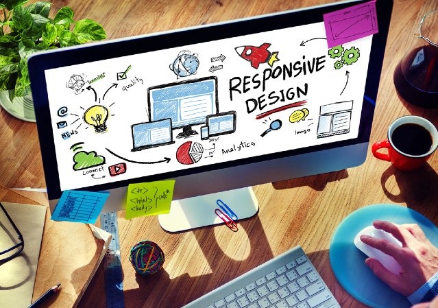
Responsive User Interface
When we talk about user interfaces, it’s easy to focus on what the user sees—menus, buttons, dashboards, the works. But there’s another piece that’s just as important: how they see it. Not everyone is sitting at a desk with a wide monitor. Some are on tablets, others on phones, maybe even flipping between devices in the same day.
This article isn’t about controlling the content itself; that is settings and permissions territory. This will go over some of the changes worth noting as device and window sizes change.
At a Glance
Here's a quick rundown of themes you'll encounter consistently across the UI:
- Images will fill the spaces allocated to them
- In some cases, those areas may shrink or expand
- 'Tile' positioning may change with window size
- The size of tiles may change with window size
- Navigation may be converted to slide-in on smaller devices
- Button captions may be shortened on smaller devices
In this short example, we can see a couple of these at play:
Images Filling Space
We can see how the exact contents of the course thumbnails gain or lose visibility depending on a user’s screen size. Starting with a mobile view and expanding to what a desktop user might see, the image adjusts to fit its container.
Tile Position Changing
Mobile screens don’t offer a lot of horizontal real estate. As window sizes shrink, you’ll see fewer tiles displayed side-by-side. But don’t worry—they’re not gone, just stacked vertically for easier scrolling.
Navigation Changing Styles
Sidebar navigation can be tricky on handheld devices, so you have identified that there's no apparent navigation initially - it's actually consolidated into the navigation tile in the top left of the page, and will scroll down with the user. On smaller screens, navigation automatically converts into this slide-in navigation menu. It’s the same content—just presented in a format that’s easier to use with thumbs instead of a mouse.
Button Captions Shortened
On compact devices, the interface adjusts to prioritize space. In some cases, button labels might be hidden, leaving just the icon. Pay attention to the "Sign Out" button in the top right, to see how the icon remains, but the text leaves. This helps keep things neat without sacrificing functionality— Users can still access everything they need to take training.