Branding your Axis LMS Courses

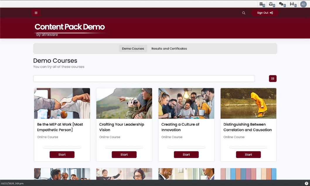
Courses are the primary method of tracking your users' progress within Axis, and because of how much time your users are going to be spending there, it’s important that you’re not limited to just changing a banner; with Axis LMS, you’re able to tailor the entire User Interface.
This is done by giving admins multiple levels of customizability - from system wide changes that affect every course, all the way down to a specific course section.
- Learning Portal - make changes that will affect all of your courses
- Course - make changes to affect a specific course
- Course Page - change aspects of a specific page of a course
- Learning Object Icons - change specific icons of your different modules
And of course, after perfecting one of your courses, it can be duplicated indefinitely - so if there is little deviance in your courses, you’ll only need to make your changes once.
Making changes on the Learning Portal is the best way to make changes to all of your courses. This includes simple changes like banners and background, but can extend to JavaScript and CSS you want on all of your courses. By default, all of your courses will pick up these Learning Portal changes, but you can disable them from your course’s Branding & Design section, and overwriting the changes.
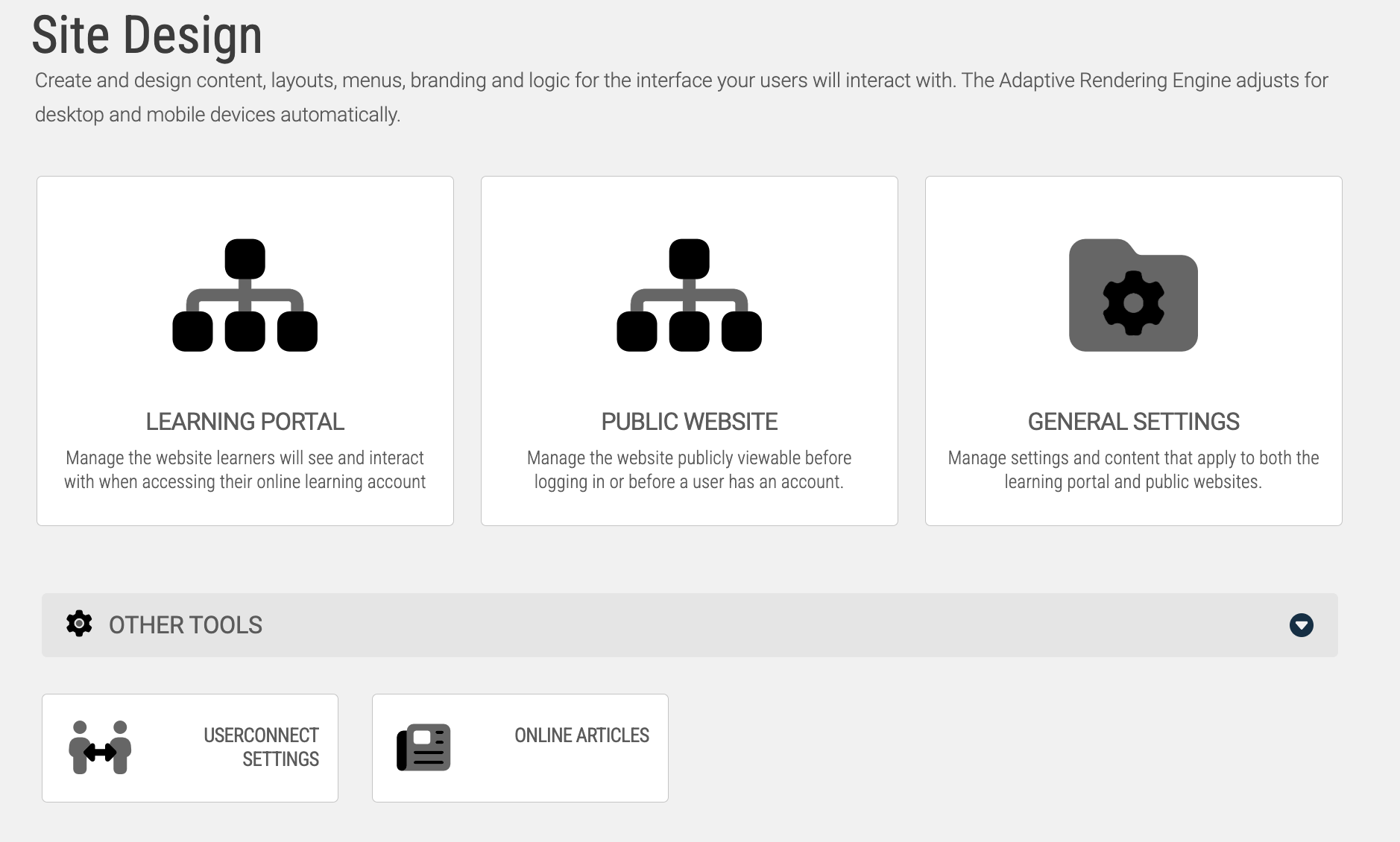
To make changes on the Learning Portal level, you’ll want to head into your Learning Portal’s settings, accessible via the System tab. Once there, open your Site Designer and select Learning Portal Website.
There are a handful of changes that can be made from this page, but this article is only going to go over those which will affect all of your courses.
Site Settings
System > Site Design > Learning Portal > Branding & Design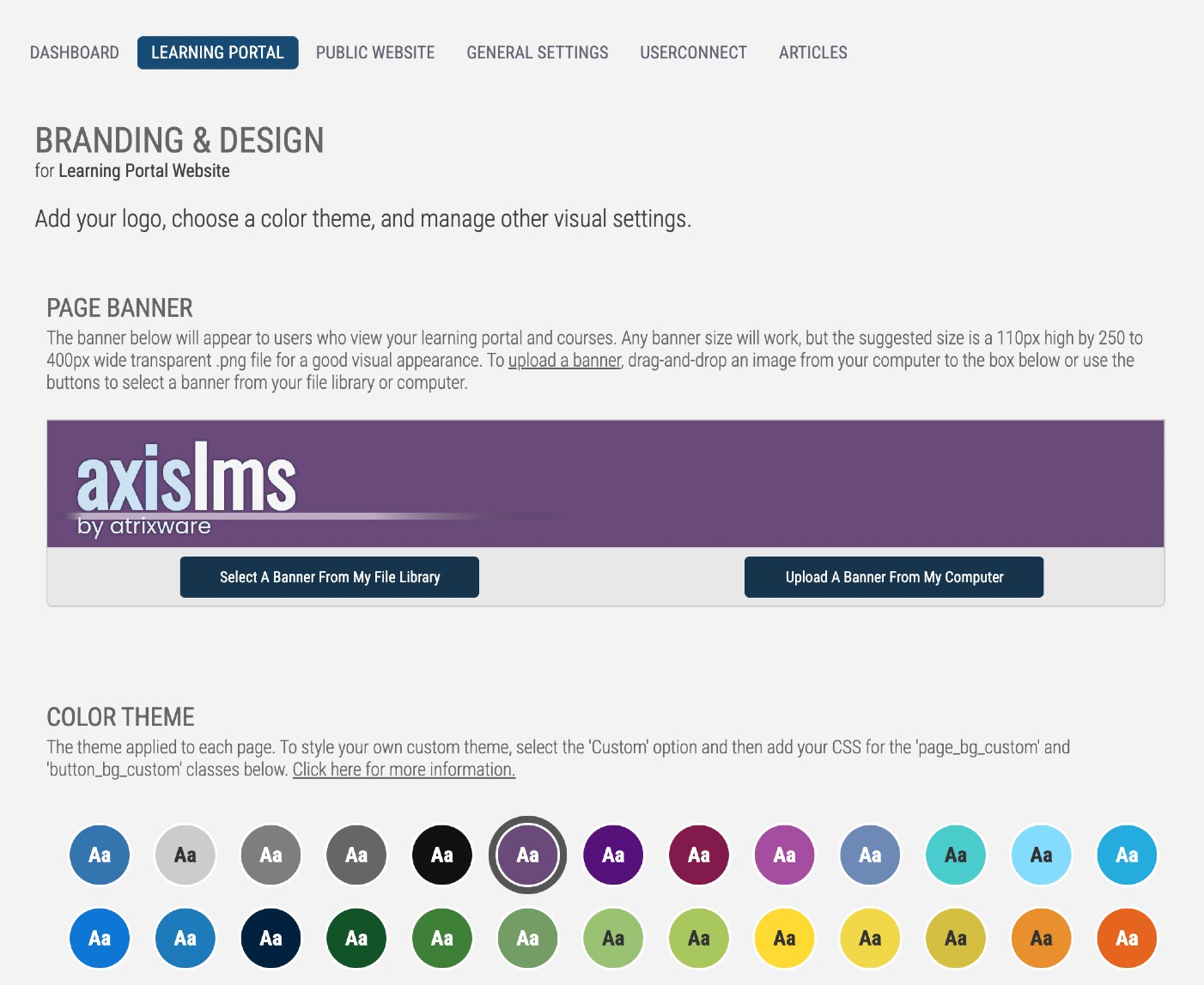
JavaScript and CSS
Both JavaScript and CSS have their own sections, which allow administrators to use snippets of code which can flow through all the way down to their courses. CSS specifically, is very useful, as it is either going to affect the page, or it isn’t. CSS is also broken into two types: Desktop and Mobile; depending on the device a user is accessing the LMS from, you can use different CSS.
Course SettingsLearning > Online Courses > Manage > Branding and Design
Making changes on the course level is an effective way to make select courses use a different style than those using the Learning Portal settings.
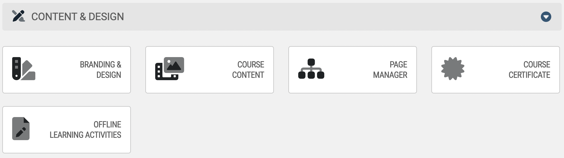
To make changes to an individual course’s visuals, select Online Courses from your Learning tab, then select which course to work with. From the course’s dashboard, look for the Branding & Design tile.
Branding and Design
The Course Banner is what will appear at the top of every page of the course. If a banner is not selected, the course will use your Learning Portal banner.
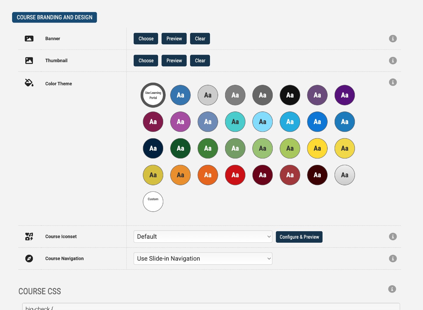
The Course Thumbnail is how this course will be represented on both the admin and user-side. This icon is used in many course listing widgets on the user-side, and several areas on the admin side, such as the Manage Courses listing. If a thumbnail is not selected, this will use one of the default course icons.
By default, your courses will use your Learning Portal theme. There are several dozen to choose from, but you can create a custom one by selecting the Custom Tile, and adding a line of CSS to the CSS section.
The Course Navigation allows the admin to choose where the navigation is placed in the course: left, top, right, or hidden. This will default to the left, but depending on your clients, and the number of pages in the course, placing it on the top, or removing it entirely may be a good option.
There is a lot of different CSS you can use in your courses - below are some of the most commonly used examples. If you’re not familiar with CSS, it is highly recommended that you not stray far from these examples, save for the bolded areas; these are hexadecimal values, which can be replaced with other 6-digit values.
- Anywhere you see a pound sign (#) followed by 3 or 6 digits is a color; you can find hex codes for your company's colors here
- Anything written in between /* */ are comments that don't need to be included, but are useful if you're not familiar with CSS
Module Statuses
.status_complete, .status_submitted {background-color:#c4d879;/* Change the color of the 'Completion' Module Statuses */}.status_paused {background-color:#f1d289;/* change the color of the 'Paused' Module Status */}.status_complete, .status_submitted, .status_offline_submitted, .status_started, .status_paused, .status_autosave, .status_other {display: none !important;/* hide all your module statuses */}Besides working on a course as a whole, you are also able to apply page-specific JavaScript and CSS. To access this, go to your Page Manager from your course’s dashboard, then edit a page’s settings.
Whenever you add a learning object to one of your Axis LMS courses, that learning object is given a default icon to help both the user and the admins distinguish what type of content it is. By click on the ? button, you are able to use one of hundreds of pre-populated icons.
If you’d like to use your own icons, and logos, it’s a very simple procedure. Before uploading any icons you intend to use for learning objects, keep in mind that the pre-populated icons are 128 x 128 pixel square PNG images. You’ll want to do your best to mimic these conditions to prevent your icons from appearing blurry or stretched.
To upload your own learning object icons:
System > File Manager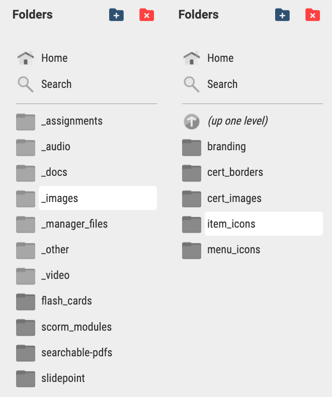